Generate a brand colour palette.
Browse 15 curated palettes across 5 moods. Every hex code is printed on this page, and any value copies with a click.
This page lists 15 brand colour palettes across 5 moods, with all 75 hex codes printed on the page and a note on which colour should do which job in each one. Pick a mood to see the palettes grouped and copy any value with a click. They are curated starting points chosen by eye, not algorithm output, and none of them has been tested for contrast compliance. Check that yourself before using one for body text.
Choose a brand mood
Pick a mood to see its 3 palettes as swatches, and find all 15 with their hex codes further down this page.
What is a brand colour palette?
A brand colour palette is the small set of colours your business uses everywhere, each with a set job.
It usually runs on 1 dominant colour, 1 supporting colour and 1 to 3 accents.
The values are written down as HEX, RGB and CMYK, so your signage, website and invoices all match.
A palette is 1 part of the identity it belongs to, alongside the logo and the type.
All 15 palettes and their hex codes
Here’s the full set, with every hex code printed on the page.
The note in each row says which value carries backgrounds and text, which one is the single brand colour, and which ones work best in small amounts.
| Palette | Mood | Hex codes | How to divide it up |
|---|---|---|---|
| Electric Ember | bold | #0B0F2B #F63A5F #FFB400 #1BD3C2 #FFFFFF | The near-black carries backgrounds and body text. The red-pink is the single action colour. Amber and teal are accents used sparingly, and white does the breathing room. |
| Noir Pop | bold | #111827 #FF3C68 #7C3AED #F3F4F6 #F59E0B | A dark neutral base with 2 competing brights. Pick either the pink or the violet as the dominant accent and hold the other back, so the 2 work together. |
| Citrus Ink | bold | #1E293B #EAB308 #DC2626 #0F172A #FEF3C7 | The 2 dark slates give depth with a softer edge than flat black. Yellow leads, red is reserved for genuine emphasis, and the pale cream keeps large areas light. |
| Slate and Sage | calm | #334155 #94A3B8 #CBD5E1 #D1FAE5 #0F172A | A greyscale ramp doing most of the work, with 1 soft green as the only real colour. Restrained enough to sit under dense text without competing with it. |
| Morning Dew | calm | #1E3A8A #BFDBFE #F1F5F9 #475569 #FFFFFF | Deep blue for headings and structure, pale blue for panels and highlights, grey for secondary text. The most conventional palette here, which is often the correct choice. |
| Misty Harbour | calm | #0C4A6E #7DD3FC #E0F2FE #64748B #F8FAFC | Same structure as Morning Dew shifted towards cyan. Reads slightly more technical and slightly less corporate. |
| Sunshine Skipper | playful | #FDE68A #F472B6 #60A5FA #FB923C #1E293B | Here, 4 brights are held together by 1 dark slate. The slate gives every bright the contrast it needs to read, so keep it in every layout. |
| Candy Pop | playful | #EC4899 #FBBF24 #22D3EE #A855F7 #FFFFFF | High saturation across the board. Works when 1 colour is chosen as primary and the rest appear only in small quantities. |
| Juice Bar | playful | #F97316 #84CC16 #14B8A6 #F43F5E #FEF9C3 | Warm and cool brights against a pale yellow. Suits businesses with product variety where each line can take 1 colour. |
| Midnight Velvet | luxurious | #0C0A1F #7C3AED #E5CBA8 #FFFFFF #D4AF37 | Near-black base with violet as the brand colour and 2 metallics for detail. The gold works best in small amounts, and a printed proof shows how it reproduces on paper. |
| Emerald Oak | luxurious | #064E3B #065F46 #D4AF37 #F5F5DC #1F2937 | The 2 greens sit close enough to layer softly, with gold for detail and a warm off-white for large areas. Traditional rather than modern. |
| Rose Noir | luxurious | #1A0F1F #C084FC #F9A8D4 #F5E9D8 #B45309 | A very dark plum base with pinks stepping up in lightness. The amber is a punctuation colour, kept for small details. |
| Eucalyptus and Clay | natural | #3F3F1B #A3A380 #D6CE93 #EFEBCE #7C3626 | A muted olive ramp from dark to pale, with terracotta as the only saturated colour. Low contrast by design, so check legibility before committing to it for body text. |
| Desert Terracotta | natural | #78350F #D97706 #FEF3C7 #84CC16 #292524 | Warm browns and amber against a near-black, with green as the accent. Reads outdoors and hands-on rather than clinical. |
| Forest Floor | natural | #14532D #166534 #BBF7D0 #FEF3C7 #78350F | A pair of deep greens for structure, a pale green for panels, cream for large areas and brown for grounding. The most legible of the natural set. |
Which mood suits which business
Mood is a shortcut: it describes the feeling a set of colours tends to produce.
The fit is worth checking against what your customers are actually deciding when they choose you.
- Bold. Businesses that need to be noticed before they're understood: hospitality, fitness, events, anything competing for attention in a crowded street or feed.
- Calm. Businesses selling reassurance rather than excitement: professional services, health, finance, and anywhere a customer is already slightly anxious.
- Playful. Businesses whose customers are choosing with their mood: childcare, food, retail, creative services, and anything bought as a small treat.
- Luxurious. Businesses where the price is the point: premium trades, jewellery, high-end hospitality, and services sold on craft rather than convenience.
- Natural. Businesses whose story is materials, land or provenance: landscaping, produce, building, wellness, and anything selling on where it came from.
For a venue, restaurant branding covers colour on a menu and a shopfront, and for a trade business, branding for tradies covers colours that read on a ute.
How the colours share the work
A common starting split is about 60% dominant, 30% supporting and 10% accent, and the “How to divide it up” note on each palette above says which colour does which job.
That split is a design convention, and it gives a page a clear focus and room for emphasis.
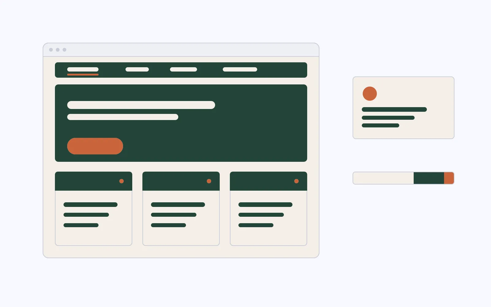
The way the colours relate to each other is the scheme:
- Monochromatic: shades of 1 hue, which reads calm and consistent.
- Analogous: neighbouring hues, which reads harmonious and cohesive.
- Complementary: opposite hues, which gives the accent its punch.
Before you commit to a palette
- Test it on your own material. Colours behave differently in a 5-swatch strip than they do on a page with text, a photograph and a logo on it.
- Check the contrast. Run every text-on-background pairing you intend to use through a contrast checker, since several palettes here are low-contrast by design.
- Look at it printed. A colour that glows on a backlit screen can print flatter on uncoated stock, so check a proof of anything from menus to printed collateral.
- Check your competitors. If the 3 businesses you’re most often compared to all own a colour, a different one helps you stand apart.
- Write the values down. Record HEX for screen, RGB for digital artwork and CMYK for print, in the format set out in the guidelines structure guide, so the colour stays the same in every tool.
Where a palette comes from
A palette follows from a positioning decision: who you’re speaking to, and what they need to feel before they get in touch.
That’s why a law firm and a childcare centre land in different places.
That work sits in brand strategy, and it’s what turns a set of good colours into a brand identity that holds up everywhere.
For a palette built for your business, send the brief through the quote form, and I’ll quote on the actual scope.
“I recently had Chris refurb my website and it looks stunning! Chris is a great communicator and provides excellent customer service and I highly recommend him.”
Frequently Asked Questions
A small business brand is easiest to run with 3 to 5: 1 dominant colour, 1 supporting colour, and 1 to 3 accents used sparingly.
With 3 you have room for emphasis, and a ceiling of 5 keeps the brand consistent.
Every palette on this page is built to 5, so you can drop the ones you don't need.
Hex values aren't copyrightable, so the combinations on this page are free to use as starting points.
In Australia a colour can be registered as a trade mark once a brand has made it distinctive in its category, so if you're in the same field as a well-known brand, a quick search of the IP Australia trade mark register is worth doing.
I'm not a lawyer, so treat that as general guidance and check anything specific with a trade mark attorney.
The bigger question is usually competitive: choose a scheme that sets you apart from the businesses on your street and in your search results.
They're starting points chosen by eye, so run your intended text and background pairings through a contrast checker before you commit.
Several palettes here are deliberately low-contrast, which suits brand colour, and the checker shows which pairings are strong enough for body text.
Enough contrast between text and background to read comfortably, 1 colour clearly doing the job of primary, values that print as well as they display, and a light and a dark that let you build layouts without inventing new colours later.
When I build a palette for a business, all of that is designed in from the start.
Ready for a real quote?
A tool gives you a starting point, and a quote comes from me reading your actual brief.
Send the brief, and I aim to reply within 1 business day.
“The new website looks great, functions brilliantly, and the ongoing support has been invaluable.”